1D data
updated: 2022-09-21
The most simplest form of data is a list of values. The values can be categorical or quantitative. Let's focus on a list of numerical values.
How can we visualize the list of numerical values? If our data is small, maybe we can show them all using a scatter plot like this:
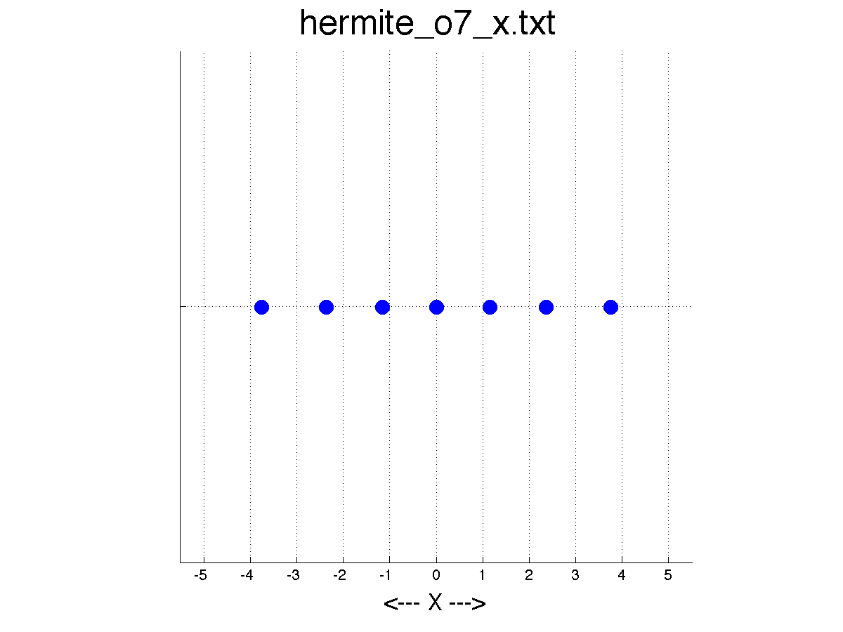
This is clear and transparent because we can see the data itself. This, however, breaks if we have more data points. For instance, multiple data points may take the same or very similar values but appear as a point because they are heavily overlapping. Or, we may see a line because all data points fill in every gap between points.

So, what else we can do? There are two approaches:
- Make them visible somehow
- Aggregate or summarize the data
1. Make them visible somehow
A little tweak can make the data points more visible, if the number of data points is not so many. One tweak is to use the y-axis. We can randomly assign a y value to each data point to tease out the occoluded data points.
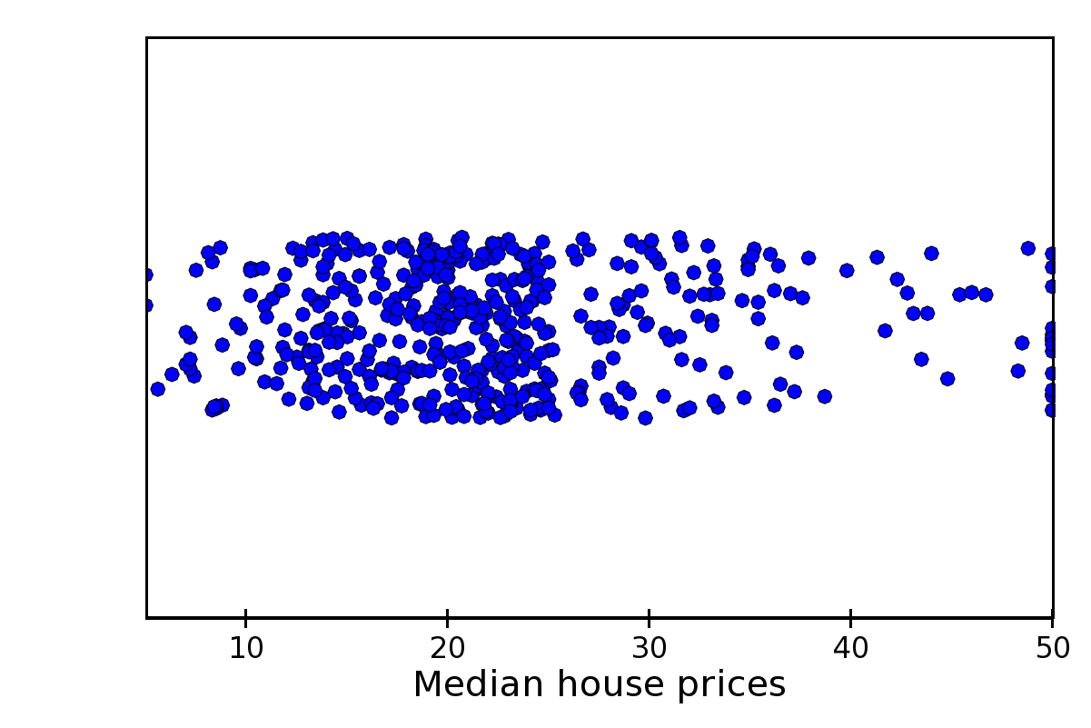
Now, we can see more points. This technique is called Jittering. The scatterplot with jittering is called jittered scatter plot. But, even with jittering, there may be still some occlusions. In this case, the data become more visible if we place them carefully such that the data are not overlapping. This is where beeswarm plot, or swarm plot, comes in.

Swarm plot is nice because it shows all data points and also the distribution of the points in an organic fashion.
Alternatively, we can make the scatter plot more visible without jittering.
- Making the points more trasparent
- Drawing only the edges of visual elements
- Visualize only randomly sampled data points
2. Aggregate and show the summary statistics
The aforementioned approach only works when the number of data points is not so huge. If we have millions of data points, there is no way to visualize each point in a perceiveable way. In this case, we have no choice but to show the summary statistics.
A common visualization technique is box plot.
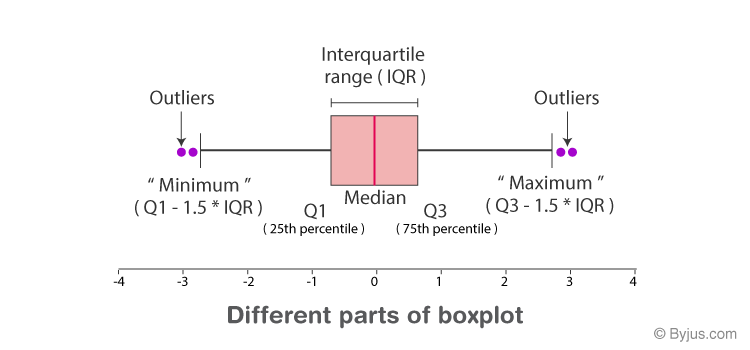
Although we often use box plots, not many people have drawn box plot by hand. I had a chance to draw the box plot and found it fun.
Histogram is another common way to represent the distribution of 1 dimensional data points. Let me write up the definition of the histogram.
*Histogram represents a frequency of data points in each segment by area. *
This sounds simple but is surprisingly tricky when thinking about the details.
First, histgram does not have no gap in its segments, since histgram represents a distribution of a continuous variable. This is differet from bar chart that represents the frequency of categorical variables.
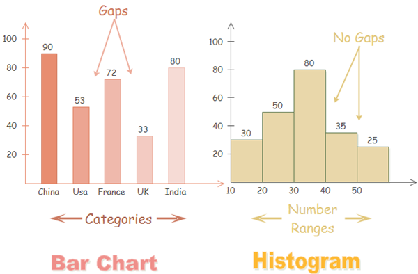
Second, the histgram represents the frequency by area, not hight. The area and hight are proportional if we use the equal-sized bins. However, if the width of bins takes different sizes, we have to normalize the frequency.

(Left: histogram with equal-sized bins; Center: histogram with unequal bins but improper vertical axis units; Right: histogram with unequal bins with density heights).
References
- https://chartio.com/learn/charts/histogram-complete-guide/
- https://ldld.samizdat.cc/2017/untitled-3/