Design
A good visualization is organized into parts that are coherent to each other to provide righ informations with clarity. Design is about how we organize parts to make a more unified whole. With design, we can direct reader's attention and structure rich infomration.
Gestalt Principle
"The whole is something else than the sum of its parts."
as encapsulated by a German Gestalt Psycologist, Kurt Koffka. We make sense of complex worlds by grouping different elements. We perceive the whole as a unified whole, not as a sum of its parts.
On the side note, this phrase is a translation from German, and there was another incorrect translation that goes like "The whole is greater than the sum of its parts." But the original argument of Kurt is that the "whole" is a different element added to its parts, not greater than its parts.
There are three fundamental principles of how we group things together:
#1: Objects are perceived in the simplest form.
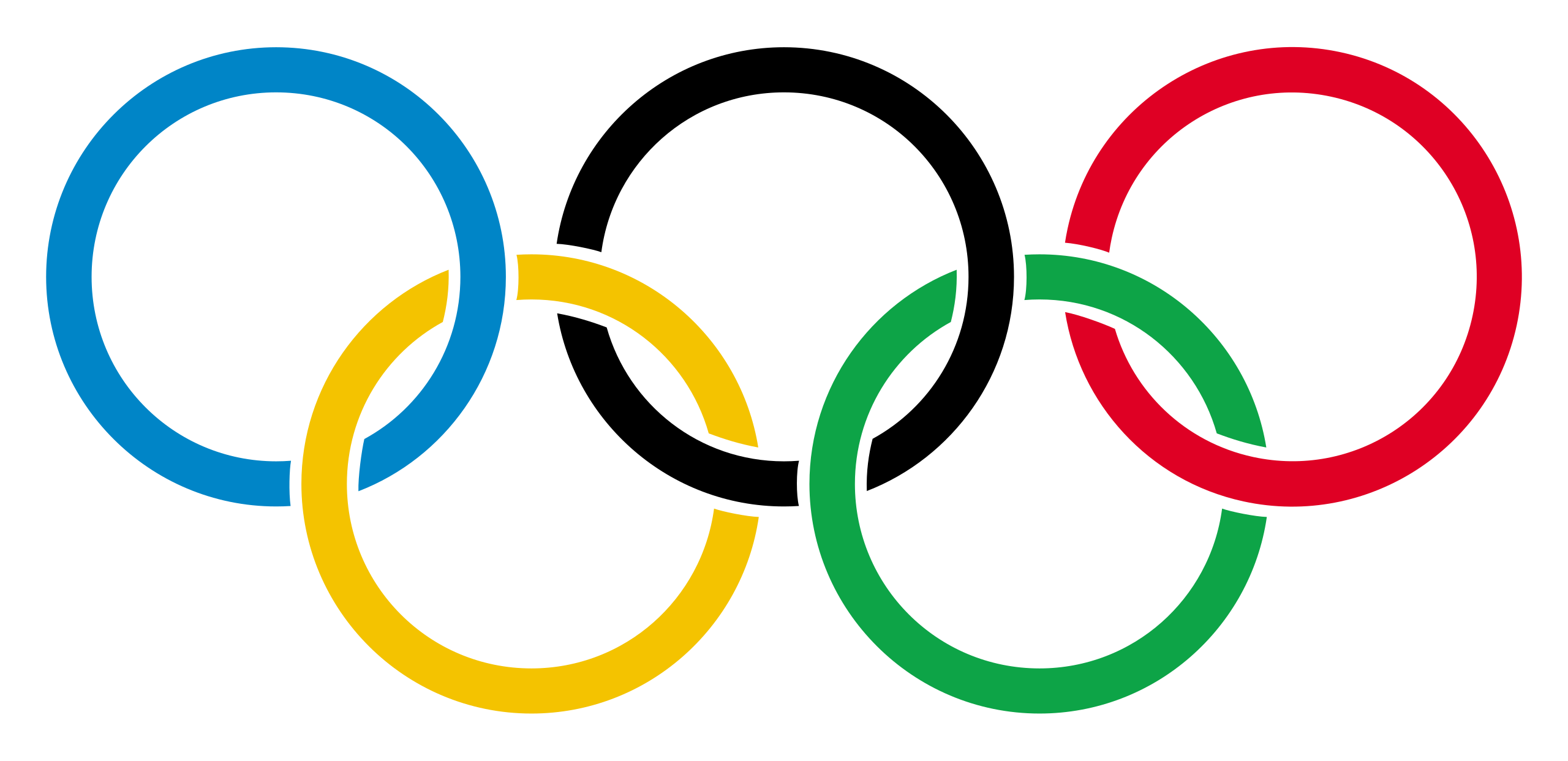
For example, when we see the Olympic logo, we perceive it as five rings interlocking each other, instead of different (non-ring) objects that are separated to each other.
#2: Our eyes naturally follow smooth lines and curves.
If you drive a car, you should see that lanes are separated by a sequence of white rectangles. We follow them as if they are a continuous line, although each element is disconnected and not related to each other.

#3: We tend to fill in the details if parts are incomplete.
When an object is incomplete, we tend to fill in the details. For example, the logo of WWF dones not have some outlines. Still, we perceive it as a panda bcause we subconciously fill in the missing outlines.

Five laws of Gestalt Psychology
The three fundamental principles lead to several laws of Gestalt Psycology.
1. Law of similarity
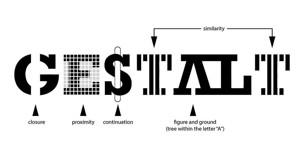
We tend to group things that are similar. For example, Slack logo consists of many different parts. But we tend to group parts of the same color and percieve four parts making up the logo. The logo of NBC also uses the law of similarity. It represents wings of peacok. Although each wing has a different color, they are perceived as a unified whole because all wings have the same shape. The notion of "similar" can be anything, as long as we can perceive it.


2. Law of closure
When an object is incomplete, we tend to fill in the missing parts. For example, we may perceive a triangle in the following figure even if the triangle doesn't exist . It's because we fill in the lines to make up a triangle. It's also related to the first principle.

3. Law of proximity
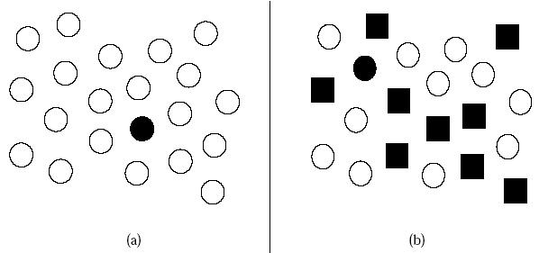
We tend to group things that are close to each other. For example, we can read "UX" in the figure because we tend to group points that are next to each other as a group.
4. Law of simplicity
We tend to group things in the simplest form. For example, we perceive the logo of Indiana University as "I" and "U" intersecting each other, even if there are many but more complex decomposition sof the logo.

5. Law of continuity
Our brain has a tendency to decieve smooth lines and curves. For example, in the logo of IBM, the words "IBM" appears to be easy read despite many gaps.

Implication for data visualization
Gestalt psychology suggests that we make an implicit link between visual components through shapes, colors, positions and size. We can leverage these implicit links to help readers go through the visualization in a desired order and organize information into groups.
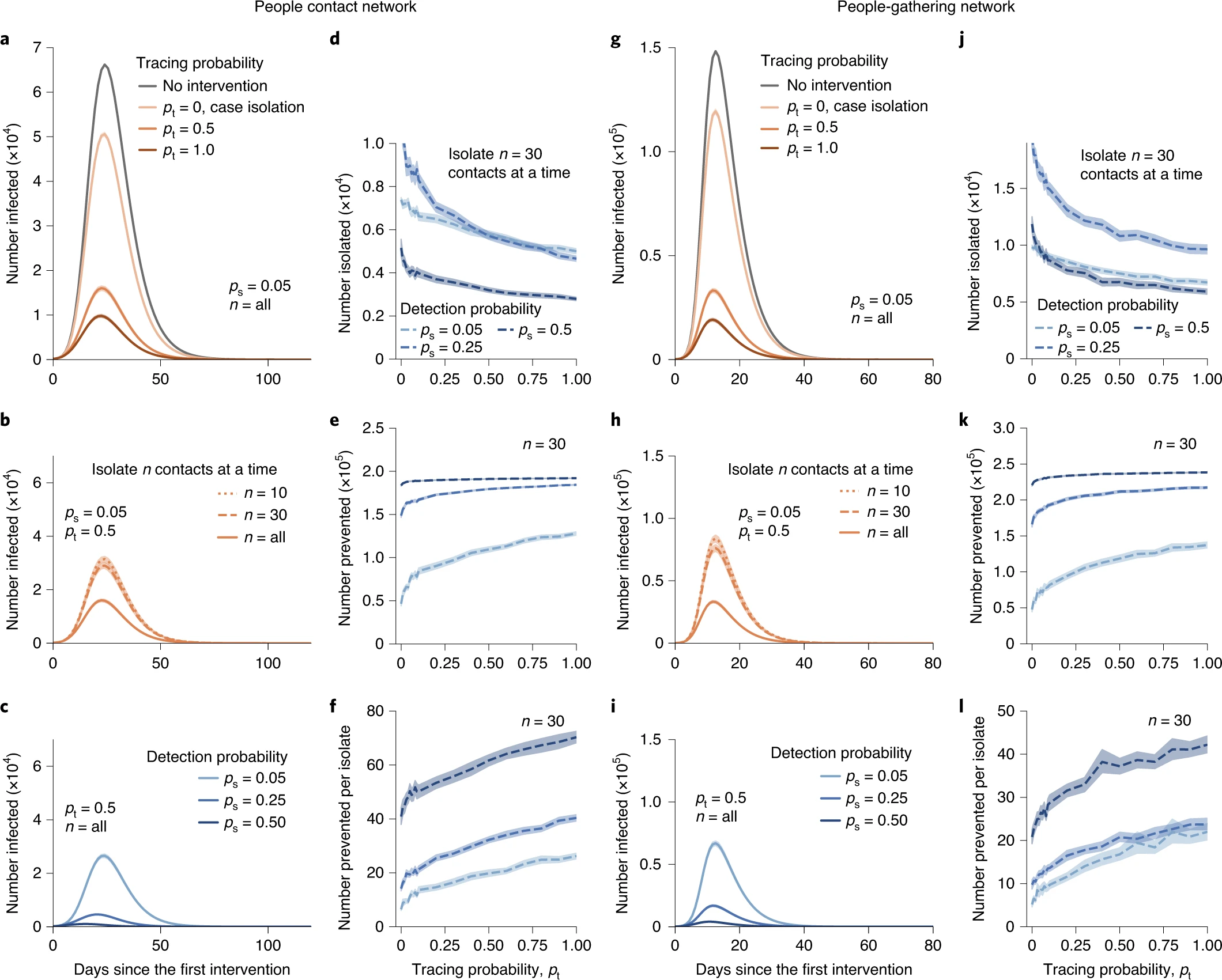
Let's consider a bad example and demonstrate how we can improve it. The following figure is taken from my paper on backward contact tracing (paper). This figure consists of two sections, one for the right half, and the other for left half. For each section, there are six panels showing the statistics of the simulations. Each panel has an order vertically.
We can make these panels more coherent by making some implicit links with the Gestalt principles. For example, by widening the gap between two sections (e.g., columns with d and that with g), we can indicate the section structure. Or we can use the same color for all panels in the same section. To guide readers to flow vertically, we can reduce the vertical gap.
Why we group things togeter?
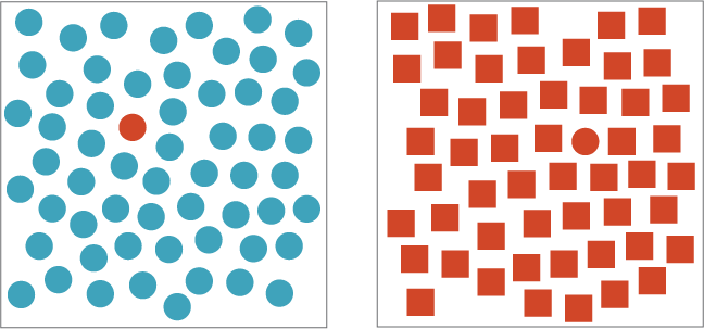
Our perception of grouping is deeply attributed to how our brain processes information. When an information comes into our brain, we pre-process the information before consciously process it. This is called pre-attentative process. It is a process that takes place subconciously before we pay attention consciously. Pre-attentive process filters out important information, which is then futher processed by more attentative process. Pre-attentative process is useful in data visualization to effectively direct our attention to the information we want to present.
Many other laws and interesting examples are here!
